On this page12 sections
- What Is a User-Friendly LMS?
- Why Does LMS Ease of Use Matter?
- Who Needs the LMS to Be User-Friendly?
- What Makes an LMS Truly User-Friendly?
- Does a Simple LMS Mean a User-Friendly LMS?
- Can a Feature-Rich LMS Still Be Easy to Use?
- What Makes an LMS Engaging Rather Than Just Easy?
- What Are the Biggest Signs of a Difficult LMS?
- How Can You Test a User-Friendly LMS Before Buying?
- Use This User-Friendly LMS Checklist
- How Does Edushade Approach the User-Friendly LMS Experience?
- The Best User-Friendly LMS Is the One Your Users Can Actually Use
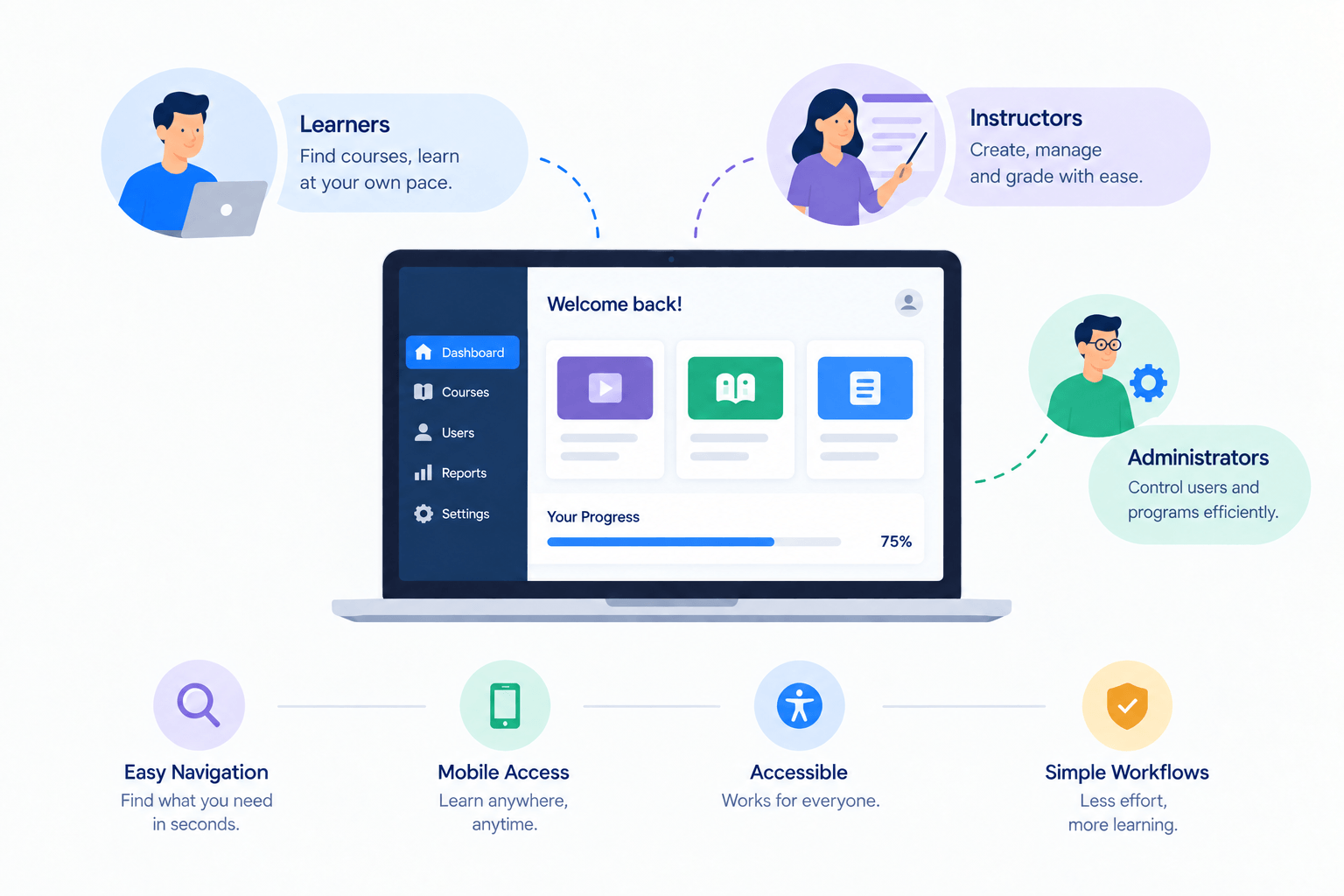
A user-friendly LMS makes important learning tasks feel obvious rather than technical. Learners can find courses, continue lessons, submit work, and understand their progress. Instructors can build and manage learning without fighting the software, while administrators can control users and programs efficiently. The real test is simple: can people complete everyday tasks with little friction or confusion?
What Is a User-Friendly LMS?
A user-friendly LMS is a Learning Management System designed around the people who actually use it. Navigation feels predictable, common tasks take sensible steps, instructions are clear, and users do not need constant technical support just to learn, teach, or administer courses.
Usability is not the same as visual simplicity. A clean dashboard may look appealing yet still hide important actions. A genuinely easy-to-use LMScombines clear navigation, efficient workflows, useful feedback, accessibility, mobile usability, and understandable controls.
The Nielsen Norman Group describes usability around making designs easy, efficient, and satisfying to use. That principle fits LMS selection well: users should be able to learn the system quickly and complete their work without avoidable effort.
If you first need the broader concept, our guide to what an LMS means explains the relationship between courses, learners, instructors, assessments, progress and administration.
Why Does LMS Ease of Use Matter?
An LMS sits between the learner and the learning experience. If finding a lesson, submitting an assignment, or checking feedback becomes difficult, users spend attention on operating software instead of completing the task they came to do.
The same problem affects instructors. A platform may frustrate learners through confusing navigation while frustrating teachers through slow course creation, complicated grading, or unclear enrollment settings. Usability needs to work on both sides.
Brock University's LMS review offers a useful real-world example. Its university community identified an intuitive, user-friendly LMS as a major need, with clear course layouts, accessibility, and a modern easy-to-use interface among the highest-ranked requirements.
The lesson is not that every institution needs the same interface. It is that clarity, accessibility, organization, and efficient task completion should be evaluated as core LMS requirements rather than cosmetic extras.
Who Needs the LMS to Be User-Friendly?
Everyone using the platform needs a good experience, but “easy to use” means something different for each role.
| User | A user-friendly LMS should make it easy to... |
|---|---|
| Learner | Find courses, continue lessons, submit work, view feedback |
| Instructor | Create content, assess learners, update courses |
| Administrator | Manage users, access, settings, programs, and records |
| Course creator | Publish and maintain learning without technical complexity |
| Training manager | Assign learning and review useful progress information |
This distinction matters during LMS comparisons. A beautiful student portal does not compensate for an administrator needing ten steps to enroll a learner. A powerful backend is equally unhelpful if students regularly cannot find their next lesson.
What Makes an LMS Truly User-Friendly?
A user-friendly LMS removes avoidable friction from the complete learning journey. The strongest systems make routine actions predictable while keeping advanced controls available when instructors or administrators genuinely need them.
1. Navigation Answers “Where Do I Go Next?”
Good LMS navigation makes location and next actions clear. Learners should quickly understand which course they are in, what they have finished, what remains, and how to continue without repeatedly returning to the homepage.
Consistency matters just as much. Similar pages should use similar labels, buttons, menus, and interaction patterns. Users should not need to relearn the interface every time they move from lessons to quizzes, assignments, or course progress.
Edushade’s student panel, for example, brings courses, assignments, exams, calendars, notifications and other learner activities into a dedicated dashboard rather than sending learners through the administrator interface.
2. The Dashboard Shows What Matters Now
A useful dashboard is not a wall of statistics. It should help users make the next decision. A learner might need today's class and unfinished assignment, while an instructor may need submissions waiting for review.
The best dashboard information is actionable. “Two assignments remaining” tells a learner what needs attention. “Twelve learners have not attempted the assessment” tells an instructor where follow-up may be useful.
Brock University's LMS consultation specifically highlighted the value of an integrated location where users could see courses, deadlines, outstanding assessments, calendars, and priorities together.
3. Learners Can Resume Without Searching
A learner should not have to remember exactly where they stopped three days ago. A user-friendly learning platform makes it easy to resume the current course and identify the next incomplete activity.
Progress indicators help when they are connected to meaningful completion rules. Edushade documents “not started”, “in progress” and “completed” activity states, course progress bars, and resume positions for supported video and audio lessons.
A progress bar alone does not make learning effective. It becomes useful when it accurately reflects the course structure and helps learners understand what they still need to complete.
4. Course Creation Follows the Way Teachers Think
An instructor should be able to think in terms of course → section → lesson → activity, not database fields and technical configuration.
Course creation becomes easier when related actions stay together. Adding a lesson, attaching a file, creating an assessment, reordering content, and updating instructions should feel like parts of the same teaching workflow.
Edushade’s course model connects courses, learning paths, cohorts, lessons, quizzes, assignments, files and live learning. That gives instructors a structured way to organize programs rather than managing each component separately.
5. Enrollment and Access Rules Are Understandable
Enrollment should answer two simple questions: Who belongs in this program, and what can they access?
Complex learning programs may still need prerequisites, scheduled access, different learner groups, or restricted content. A user-friendly LMS does not remove these controls; it makes their purpose and effect understandable to the person configuring them.
The learner experience matters too. If content is unavailable, the interface should make the reason clear where possible instead of leaving users wondering whether the course is broken.
6. Assessments Feel Clear Before, During, and After Submission
An assessment becomes frustrating when learners cannot tell what is required, how much time they have, whether their answer was submitted, or what happens next.
An easy-to-use LMS should clearly present instructions, attempt rules, questions, submission states, and feedback. Instructors need an equally clear path for creating assessments, reviewing work, grading responses, and seeing results.
Edushade documents quizzes, assignments, exams, automatic and manual grading, attempt controls, timers, question types and assessment analytics as connected workflows.
7. Progress and Grades Are Easy to Interpret
Learners should not need to calculate their own course status from five different screens. Instructors should not need spreadsheets simply to determine who is falling behind.
A useful LMS connects learning activity with progress and grading. Edushade documents lesson, quiz and assignment tracking, configurable completion rules, course progress, marksheets, weighted grading and learning-time information.
More analytics are not automatically better. A user-friendly LMS shows enough information to support a decision without forcing users to interpret unnecessary charts and metrics.
8. Mobile Use Does Not Feel Like a Compromise
Many learners check courses, deadlines, messages, or resources away from a desktop. A responsive LMS should preserve the essential learning flow on smaller screens instead of simply shrinking the desktop interface.
Buttons should remain usable, text readable, navigation understandable, and important tasks accessible. Learners should not need horizontal scrolling or repeated zooming simply to submit basic work or see what comes next.
Brock University's review also found mobile experience to be an important requirement, reflecting demand for LMS access that works naturally beyond a desktop browser.
9. Accessibility Is Built Into the Experience
A platform cannot be genuinely user-friendly if people with disabilities cannot perceive, understand, navigate, or operate important parts of it.
W3C’s Web Content Accessibility Guidelines (WCAG) 2.2 provide recommendations and testable success criteria for making web content more accessible to people with disabilities. W3C recommends using the current WCAG version for accessibility work.
When evaluating LMS accessibility, test the real learner journey: navigation, keyboard operation, forms, assessments, contrast, media, focus states, course content, and third-party tools. Accessibility should not be judged from a vendor label alone.
10. Help Exists, but Basic Tasks Do Not Depend on It
Good support matters because even intuitive software eventually presents an unfamiliar task. Clear documentation can help instructors or administrators solve those questions without opening a support request.
Edushade maintains a public Knowledge Base covering courses, enrollment, progress and grading, assessments, certificates, selling, communication, community, and other academy workflows.
Does a Simple LMS Mean a User-Friendly LMS?
Not always. Simple, user-friendly, and limited to describe different things.
A simple LMS may have fewer capabilities. A user-friendly LMS may offer advanced functionality but organize it well. A limited LMS may initially feel easy because very little can be configured, then become restrictive when the learning program grows.
| LMS characteristic | What it really means |
|---|---|
| Simple | Fewer steps, options, or workflows |
| User-friendly | Required tasks are understandable and efficient |
| Feature-rich | Supports a broader range of capabilities |
| Limited | Cannot support some required workflows |
| Complex | Requires more decisions or configuration |
The goal is not to find the LMS with the fewest buttons. It is to find the platform that makes your required tasks easy while keeping unnecessary complexity out of the way.
Can a Feature-Rich LMS Still Be Easy to Use?
Yes. Advanced capability and good usability can coexist when the interface uses sensible defaults, clear grouping, role-based permissions, and progressive disclosure.
A learner does not need every administrative option. An instructor does not need every system setting. Showing people the controls relevant to their role can preserve powerful functionality without overwhelming the interface.
This is an important buying distinction. Removing functionality can make software appear simpler, but thoughtful design makes useful functionality easier to operate.
What Makes an LMS Engaging Rather Than Just Easy?
Ease of use removes friction. Engagement gives learners a reason to continue. The two support each other, but they are not the same.
An engaging learning experience may use:
- Clear goals
- Visible progress
- Useful feedback
- Relevant assessments
- Discussion and community
- Live interaction
- Reminders
- Streaks or gamification
- Meaningful achievements
- Well-designed course content
Gamification can support engagement, but badges and leaderboards cannot rescue confusing navigation or weak course design. Learners still need useful content, clear expectations, reliable access, and feedback connected to their goals.
Edushade's Student Panel currently includes progress information, remaining tasks, learning statistics, streaks, a leaderboard, upcoming classes, and improvement areas. Those features are most useful when they reinforce the course rather than distract from it.
What Are the Biggest Signs of a Difficult LMS?
A difficult LMS often reveals itself through repeated small frustrations rather than a dramatic technical failure.
Common warning signs include:
- Learners regularly ask where their courses are.
- Users cannot tell what they should do next.
- Similar actions use inconsistent terminology.
- Routine tasks require too many screens.
- Teachers need technical help to update basic content.
- Enrollment settings are difficult to understand.
- Learners cannot clearly see progress or feedback.
- Mobile navigation feels cramped or incomplete.
- Reports need frequent manual cleanup.
- Accessibility problems block core tasks.
- Important actions are hidden inside unrelated menus.
One specialist workflow can reasonably require training. The bigger concern is when frequent, ordinary tasks repeatedly confuse the people who need to perform them.
How Can You Test a User-Friendly LMS Before Buying?
The best way to evaluate LMS usability is to test realistic tasks with realistic users. Do not judge ease of use only from a guided product demo where an experienced salesperson controls every click.
Nielsen Norman Group recommends testing with real users, because watching people complete tasks reveals problems that opinions or interface screenshots miss.
Test the Learner Experience
Give a new learner these tasks without step-by-step instructions:
- Sign in.
- Find the correct course.
- Resume the latest lesson.
- Locate an assignment.
- Complete a quiz.
- Find instructor feedback.
- Check overall progress.
- Find the next deadline.
Watch where the learner hesitates. A five-second pause, wrong menu choice, or question such as “Where would I find that?” can reveal friction worth investigating.
Test the Instructor Experience
Ask an instructor to:
- Create a course section.
- Add a lesson.
- Create an assessment.
- Review a submission.
- Give feedback.
- Update existing content.
- Check learner progress.
The instructor should be able to build a mental model of the software. If every task seems to follow a completely different logic, regular course management may become harder than the demo suggests.
Test the Administrator Experience
Ask an administrator to:
- Add a learner.
- Assign the correct role.
- Enroll the learner.
- Change access.
- Find an inactive learner.
- Review course progress.
- Find the information needed for a report.
Administrative software can reasonably contain deeper controls. Those controls should still be organized around recognizable operational tasks.
Use This User-Friendly LMS Checklist
Score each item based on what you see in the real platform rather than what appears on the feature list.
| Test | Question to ask |
|---|---|
| Navigation | Can a new learner find the next action quickly? |
| Learnability | Can users understand basic tasks without formal training? |
| Course creation | Can instructors build and update content logically? |
| Enrollment | Are access and learner rules understandable? |
| Progress | Can learners see where they stand? |
| Assessments | Are submission, grading, and feedback clear? |
| Mobile UX | Can essential tasks be completed comfortably on mobile? |
| Accessibility | Can users with different access needs operate core workflows? |
| Administration | Can staff manage routine tasks without workarounds? |
| Reporting | Does the system answer useful operational questions? |
| Support | Can users find clear help when they need it? |
| Consistency | Do similar tasks behave in similar ways? |
Do not expect one LMS to score perfectly for every organization. A university, tutoring business, corporate training team, and online academy may prioritize different workflows.
How Does Edushade Approach the User-Friendly LMS Experience?
Edushade is built around separate learner, educator and administrative workflows rather than exposing everyone to the same interface.
Its current learner panel includes courses, assignments, exams, calendars, events, notifications, progress, and a curriculum runner designed to help learners continue through their enrolled programs.
Behind that learner experience, Edushade covers course creation, assessments, progress tracking, grading, certificates, payments, communication and community management. The tutors and academies pages describe the two most common shapes.
That does not mean Edushade—or any LMS—is automatically the easiest option for every organization. Usability should be tested against your actual courses, staff, learners, requirements, and daily workflows.
The Best User-Friendly LMS Is the One Your Users Can Actually Use
A user-friendly LMS should make the right things easy: finding learning, continuing a course, completing work, giving feedback, managing learners, and understanding progress. Attractive design helps, but predictable workflows and clear decisions matter more.
Before choosing a platform, write down the five tasks learners perform most, the five tasks instructors perform most, and the five tasks administrators perform most. Then test those tasks without coaching users through every step.
If your checklist includes courses, cohorts, assessments, learner progress, certificates and broader academy management, see what Edushade documents and test those workflows against the way your own organization teaches.