
Four numbers about the audience,four charts about the rhythm
Open the Learner Analytics page and four KPI cards greet you — Total Learners, Active Learners (30d), Avg Learning Time per Week and Learner Retention — each with a percent change against the previous period. Underneath, four charts: the active-vs-inactive area trend, the learner growth lines (new sign-ups against the running total), the learning-time-by-day bars (Monday through Sunday) and the top-learners leaderboard with rank, name, courses and score.
What's on the Learner Analytics page when you open it
Four KPI cards across the top, each with the previous-period delta. Two trend charts that read the audience's rhythm — when people are arriving, when they're showing up. A by-day breakdown that names the time of week your platform is busiest. A top-learners leaderboard that surfaces the people setting the pace. One date range picker with Compare drives the whole view.
Four KPIs With the Delta
Total Learners, Active Learners (30d), Avg Learning Time per Week (in hours), Learner Retention (as a percentage) — each card carries the change vs the previous period and a trend arrow.
Active vs Inactive Area Chart
A stacked area chart traces active learners (in blue) against inactive (in purple) across the date range. The gap between the two is the engagement story; the shape tells you whether the room is filling up or quietly cooling off.
Learner Growth, New and Total
A six-month line chart with two series — new learners arriving each month and the running total — so you read the rate of growth and the absolute size on the same chart, against the same months.
Learning Time by Day of Week
Seven bars across Monday through Sunday, plotting the hours your learners actually spend on each day. Use it to time announcements, schedule live classes and plan releases for the days people are around.
Top Learners Leaderboard
The five standout learners by score, with rank, name, course count and percentage. Surface champions for shout-outs, peer mentoring or testimonials — the people moving the platform forward.
Date Range With Compare
Pick any window from the picker top-right and the whole page rescopes — KPI cards, both trend charts, the by-day bars, the leaderboard. Switch on Compare to surface the previous period of the same length on the cards.
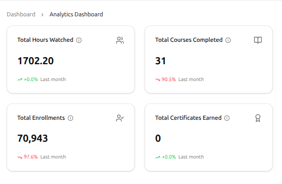
Four KPIs across the audience, with the delta on every one
Four cards, four headline numbers — Hours Watched, Courses Completed, Enrollments, Certificates Earned. Each one shows last-month change with a green-or-red arrow, so the direction lands before the number does.
Total Hours Watched — real time spent learning
Total Courses Completed — finishes, not opens
Total Enrollments — seats taken across courses and paths
Total Certificates Earned — milestones reached
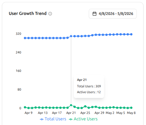
User growth and activity — two lines, one chart
The User Growth Trend chart traces two lines across the date range you pick. Total Users tells you how the audience has grown; Active Users tells you who's actually showing up. Hover any day for the exact pair of numbers.
Total Users — how the audience has grown over time
Active Users — who's actually showing up day to day
Hover any point for the exact numbers behind it
Date range picker scopes the whole chart
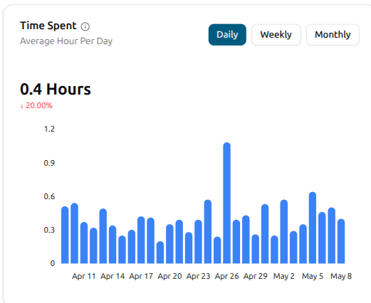
When learning actually happens — daily, weekly, monthly
The Time Spent chart plots the average hours your learners put in across the date range. Toggle Daily, Weekly or Monthly and the bars rescope. The headline carries the period average and the change vs the last period — a red arrow on a quiet stretch is your cue to send a nudge.
Daily, Weekly and Monthly views in one toggle
Average hours per period across the date range
Headline shows the period average with last-period delta
Hover any bar for the exact number behind it
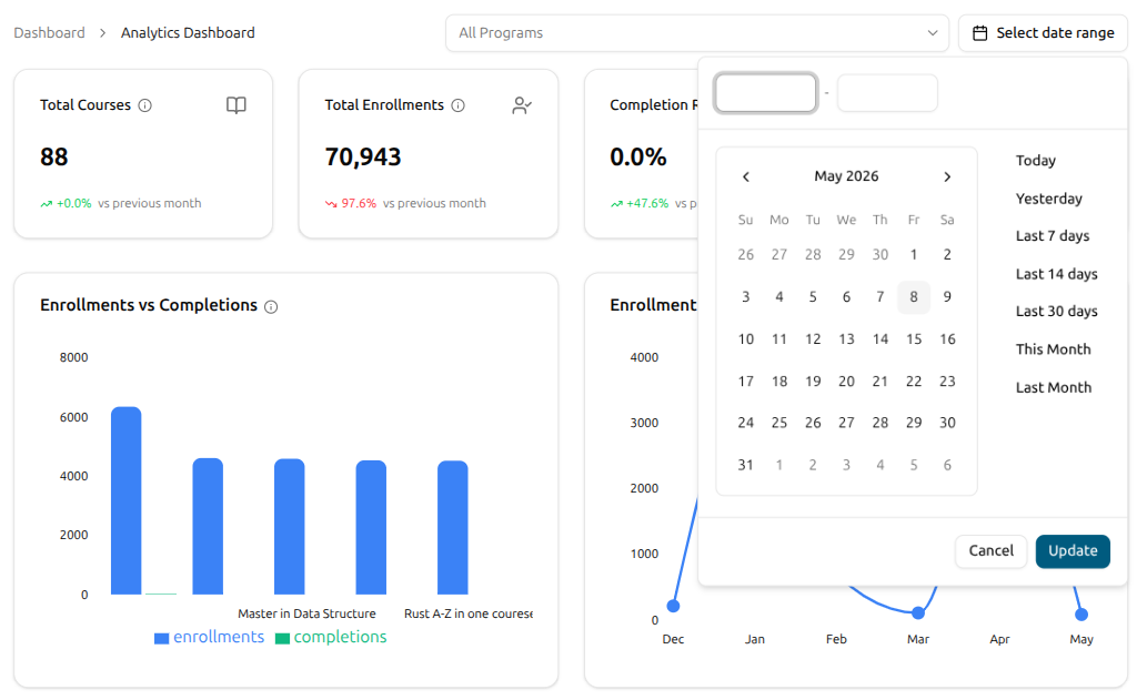
Pick a window, pick a program — the whole page rescopes
Top-right sits a date range picker with one-click presets — Today, Yesterday, Last 7 / 14 / 30 days, This Month, Last Month — plus a custom start and end. An All Programs filter sits beside it to narrow the view to a single program. Pick either and every KPI and chart rescopes, with the vs-previous-period deltas refreshing as you go.
Quick presets — Today, Yesterday, Last 7 / 14 / 30 days, This Month, Last Month
Custom start and end dates
All Programs filter to scope to one program
Every KPI and chart rescopes; vs-previous-period deltas refresh
From a fresh open to a meaningful read on the audience
There's nothing to instrument. Once your platform has learners on it, the cards and charts fill in. Open the page and the picture is waiting.
Open Learner Analytics
Jump to Learner Analytics from the admin's analytics area. Four KPI cards greet you up top — Hours Watched, Courses Completed, Enrollments, Certificates Earned — each with a vs-last-month delta and a green-or-red arrow.
Pick a date range, scope by program
Use the date range picker top-right to scope the page to whatever window you want — Today, Yesterday, Last 7 / 14 / 30 days, This Month, Last Month, or a custom span. The All Programs filter beside it narrows the view to one program when you need it.
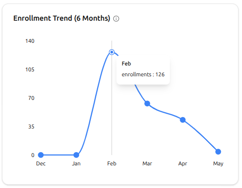
Read the trend across six months
The Enrollment Trend chart traces six months of sign-ups so the story tells itself. A spike one month is a campaign that worked; a dip the next is a cue to revisit. Hover any point for the exact count behind it.
Learner Analytics FAQ
What admins, founders and program managers ask the first time they sit down with the audience view.
Can't find what you're looking for?
Contact Sales

Start Building Learning Your Way
Set up courses, programs, and learning experiences without forcing your process into rigid software. A connected system for students, educators, and administrators.
Build Your Academy